 By Stephanie Taylor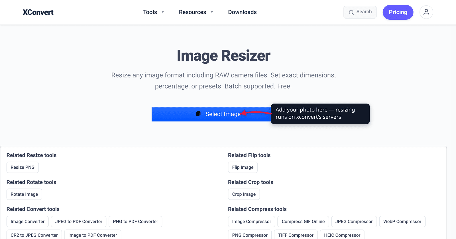
You shot a photo on your phone, it came out 4,000 pixels wide and 6 MB, and now your website wants it for a 1,200-pixel-wide column. Two different fixes hide behind the word “resize,” and mixing them up is why pages stay slow. Resizing changes the pixel dimensions — 4000px wide becomes 1200px wide. Compressing changes the file size at the same dimensions — same 1200px, smaller bytes. For the web you almost always want both: resize down to the size it’s actually displayed, then compress (and ideally convert to WebP). This guide separates the two, gives you real pixel targets for hero images, content, and thumbnails, and explains why DPI — the number everyone worries about — is irrelevant on screens. We verified the rendering behaviour and browser support against MDN, Google’s web.dev, and caniuse.
Quick answer: Resizing reduces pixel dimensions; compressing reduces file size at the same dimensions. Both shrink the file, and for the web you do both: resize to roughly the size the image is displayed (full-width ≈ 1600–2000px, in-content ≈ 800–1200px, thumbnails ≈ 150–300px), then compress and convert to WebP. Don’t upload a 6000px phone photo into an 800px slot. DPI/PPI is irrelevant on the web — browsers render from pixel dimensions and ignore the DPI tag entirely; it only matters for print.
Jump to a section
- Resizing vs compressing: two different knobs
- How many pixels do you actually need?
- Why DPI doesn’t matter on the web
- The web image workflow: resize, then compress
- Resize an image for the web on xconvert
- FAQ
Resizing vs compressing: two different knobs
These two operations both make a file smaller, but they change different things, and good web images use them together.
Resizing changes the pixel dimensions — the width and height in pixels. Take a 4000 × 3000 photo down to 1200 × 900 and you’ve thrown away three-quarters of the pixels. Because file weight scales with pixel count, this is usually the single biggest win: halving each dimension cuts the pixel count to a quarter, so the raw weight drops roughly 4×. There’s a hard rule here — you can resize down without quality loss, but resizing back up (upscaling) just invents blurry pixels. Always start from the largest original you have.
Compressing keeps the dimensions and reduces the file size in bytes by encoding the same pixels more efficiently. JPEG and WebP are lossy — they discard visual detail your eye barely notices to save space, and you trade off a quality setting against weight. PNG is lossless, so it compresses without discarding detail but can’t get as small for photos.
| Resize | Compress | |
|---|---|---|
| Changes | Pixel dimensions (W × H) | File size in bytes |
| Example | 4000px → 1200px wide | Same 1200px, 900 KB → 180 KB |
| Quality cost | None going down; blur going up | Lossy formats trade quality for size |
| Best for | Photo far bigger than its display slot | Trimming the last weight after resizing |
The mistake that keeps pages slow is doing only one. Compressing a 4000px image hard still ships 4000px of data the browser has to download and scale down. Resizing a photo to 1200px but exporting it as a maximum-quality PNG still leaves an oversized file. Resize first to kill the bulk, then compress to trim the rest.
How many pixels do you actually need?
The honest answer is “about as wide as the image is displayed, times your headroom for high-density screens.” Modern phones and laptops have 2× (or 3×) pixel-density displays, so a slot that’s 600 CSS pixels wide can use a 1200-pixel image to look crisp. Google’s web.dev frames the problem directly: “Serving desktop-sized images to mobile devices can use 2–4× more data than needed.” These are practical starting targets for the longest edge:
| Use | Typical target (longest edge) |
|---|---|
| Full-width hero / banner | ~1600–2000px (1920px is the common max) |
| In-content / blog body image | ~800–1200px |
| Sidebar / card | ~400–600px |
| Thumbnail / avatar | ~150–300px |
A few caveats so you don’t over-trust any single number:
- It depends on your layout. If your content column is only 700px wide, a 2000px image is wasted bytes. Measure the actual rendered width and roughly double it for retina screens.
- The web’s recommended ceiling is around 1920–2560px for true full-bleed backgrounds; past that you’re shipping pixels almost no one sees.
- Keep an eye on weight, not just dimensions. A common rule of thumb is to keep most content images well under a few hundred KB; that’s a compression job after you’ve resized.
The headline takeaway: don’t upload a 6000-pixel phone photo into an 800-pixel slot. The browser will dutifully download all six thousand pixels, then shrink the image on screen — so the visitor pays the full download cost for detail they never see. Resize it to the slot first.
Why DPI doesn’t matter on the web
This trips up almost everyone who came from print. DPI (dots per inch) and PPI (pixels per inch) have no effect on how an image displays in a browser. A 1200 × 800 image looks and weighs exactly the same on a web page whether its metadata tag says 72 DPI, 96 DPI, or 300 DPI — because browsers render from the pixel dimensions and ignore the DPI tag entirely.
DPI is a print instruction: it tells a printer how many pixels to pack into each physical inch of paper, which controls how big the photo comes out when printed. On a screen, “an inch” isn’t a fixed thing — the same image fills different physical sizes on a phone, a laptop, and a 4K monitor — so the DPI number is meaningless. What governs sharpness and size on the web is simply how many pixels the image has and how wide the slot is that displays them.
So ignore the “Save for Web at 72 DPI” folklore. Setting an image to 72 DPI doesn’t shrink it; resizing its pixel dimensions does. The only time DPI matters is when you’re going to physically print the file. For everything on a screen, pixels are the only unit that counts.
The web image workflow: resize, then compress
Put the two knobs in the right order and most images get dramatically lighter with no visible quality loss:
- Start from the largest original. You can always shrink; you can’t add detail back. Don’t pre-shrink and lose your archive copy.
- Resize to the display target. Set the longest edge to roughly the slot width × your retina headroom (see the table above). For a blog body image, 1200px wide is a safe default.
- Compress. Export JPEG/WebP at a sensible quality (around 75–85% is usually visually transparent for photos), or run it through an image compressor to hit a weight target.
- Convert to WebP where you can. WebP gives smaller files than JPEG/PNG at the same quality and is now supported by about 96% of browsers globally — Chrome, Firefox, Edge, and Safari (16.0+) all support it, per caniuse. See convert PNG to WebP for that step.
- Keep the aspect ratio locked unless you’re deliberately cropping, so the image doesn’t stretch.
If your image is already the right dimensions and you only need it lighter, skip straight to compression — see compress a JPG/JPEG image.
Resize an image for the web on xconvert
The xconvert Image Resizer handles the resize step (and lets you save straight to a web-friendly format). It works on RAW camera files too, not just JPG/PNG.
- Open xconvert.com/image-resizer and click Select Image to add your photo (from your computer, Google Drive, or Dropbox).
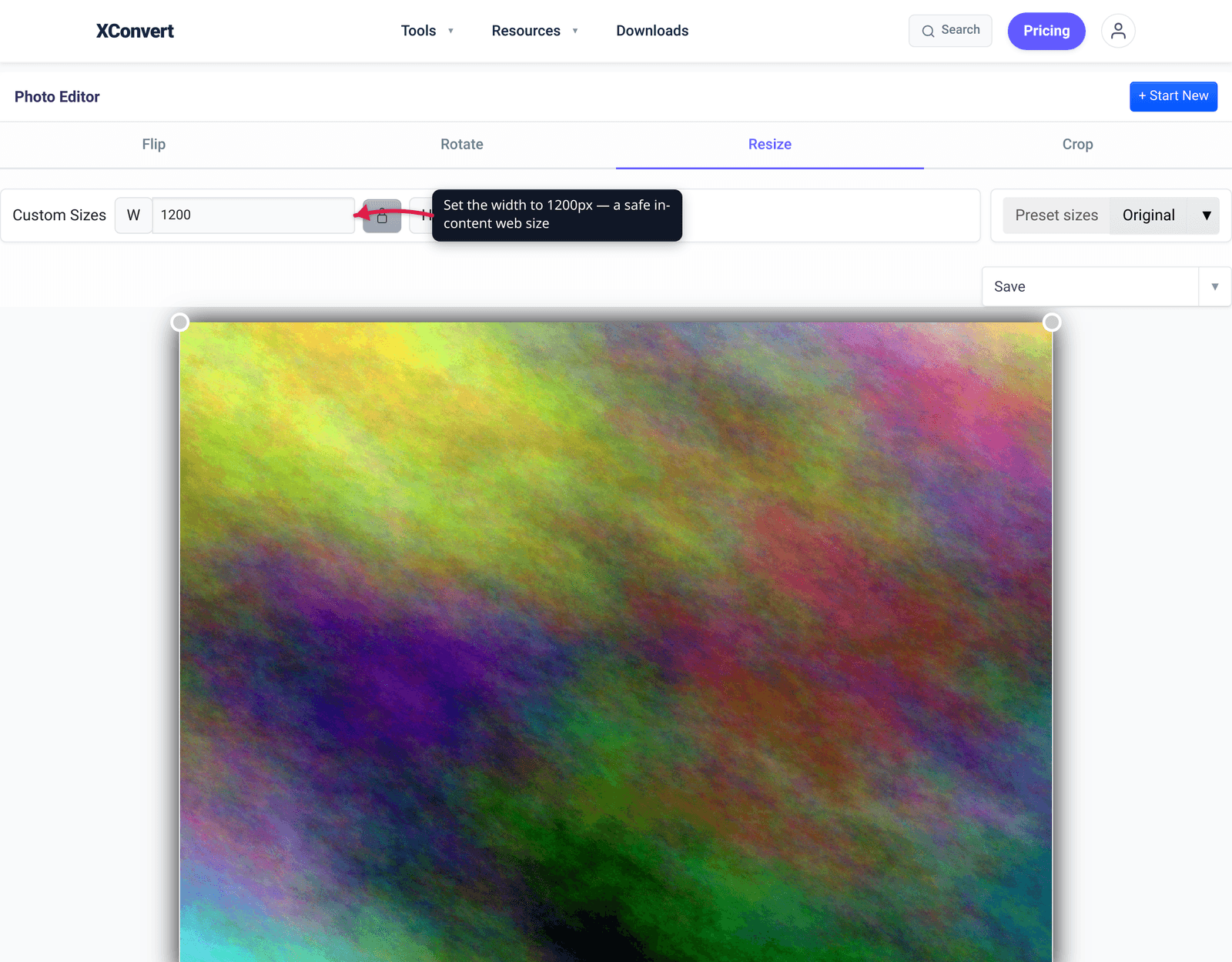
- When the Photo Editor opens, choose the Resize tab.
- Set your dimensions one of two ways: type a width and height under Custom Sizes (the W and H fields), or open Preset sizes and pick a Percentage (25%, 50%, 75%, 100%, 150%, 200%) or a Screen Size (Height) preset (170p up to 1920p — e.g. 1080p or 1200p for a large web image).
- Use the link / lock button between the W and H fields to keep the aspect ratio so the image doesn’t stretch — enter one dimension and the other follows.
- Click Save, or open the ▼ next to it to Download as WebP (or JPG, PNG, TIFF, BMP) for the smallest web-ready file.
Your image uploads over an encrypted connection, is processed on our servers, and is automatically deleted a few hours later. Nothing stays around. To then trim the file size further at the same dimensions, run the result through the image compressor.
FAQ
What’s the difference between resizing and compressing an image?
Resizing changes the pixel dimensions (e.g. 4000px wide → 1200px wide); compressing changes the file size in bytes at the same dimensions by encoding the pixels more efficiently. Both make the file smaller. For the web you usually do both: resize to the display size, then compress. Resizing down is lossless in detail terms (you’re removing pixels you don’t need); compressing with a lossy format (JPEG/WebP) trades a little quality for a lot of weight.
What size should an image be for a website?
Match the slot it’s displayed in, then add headroom for high-density screens. Practical longest-edge targets: full-width hero ≈ 1600–2000px, in-content ≈ 800–1200px, thumbnails ≈ 150–300px. Around 1920px is the common ceiling for full-bleed backgrounds. The key rule: don’t ship a 6000px photo into an 800px slot — the browser downloads every pixel before shrinking it on screen.
Does DPI matter for web images?
No. Browsers render from an image’s pixel dimensions and ignore the DPI/PPI metadata entirely, so a 1200 × 800 image looks and weighs the same whether it’s tagged 72, 96, or 300 DPI. DPI only controls physical print size. Setting “72 DPI” doesn’t make a web image smaller — only resizing the pixel dimensions does. On screens, pixels are the only unit that matters.
Will resizing an image make it blurry?
Resizing down won’t — you’re discarding pixels you didn’t need, and the image stays sharp. Resizing up (upscaling) does make it blurry, because there’s no real detail to add, so the tool stretches existing pixels. Always start from the largest original and shrink from there; never enlarge a small image to fit a big slot.
Should I resize to WebP or JPEG for the web?
WebP gives smaller files than JPEG or PNG at the same visual quality and is supported by roughly 96% of browsers (Chrome, Firefox, Edge, Safari 16.0+) per caniuse — so it’s the default choice for new web images. JPEG remains a safe, universal fallback for photos. Resize first to the display dimensions, then save as WebP for the smallest web-ready result.
How do I reduce a phone photo for a website?
Phone photos are often 3000–6000px wide and several megabytes — far bigger than any web slot. Resize the longest edge down to your display target (≈1200px for a body image, ≈1600–2000px for a full-width banner), keep the aspect ratio locked, then save as WebP or JPEG and compress. That two-step — resize, then compress — typically takes a 6 MB photo well under a few hundred KB with no visible quality drop.
Sources
Last verified 2026-06-25.
- MDN — Image file type and format guide — pixel dimensions and image-format characteristics for the web.
- web.dev — Serve responsive images (Google) — “Serving desktop-sized images to mobile devices can use 2–4× more data than needed”; sizing images to their display size and device pixel ratio.
- caniuse — WebP image format — ~96% global support; Chrome 32+, Firefox 65+, Safari 16.0+, Edge 18+.
- ForegroundWeb — DPI/PPI are irrelevant online; only pixel dimensions matter — browsers ignore embedded DPI metadata and render from pixel dimensions.
- Photo Cascadia — The 72 PPI web-image myth — debunks the “save at 72 DPI for web” folklore; resolution metadata has no effect on screen display.