A PDF page isn’t a picture — it’s a set of drawing instructions. The text, lines, and shapes are stored as vectors (math that describes “draw a curve here, fill this region there”), which is why you can zoom into a well-made PDF forever and the edges stay crisp. A JPG, by contrast, is a fixed grid of pixels. Turning a PDF page into a JPG means rasterizing it: flattening those instructions onto a pixel grid at one chosen resolution. Pick the resolution too low and the result looks soft, jagged, or outright blurry — not because the converter failed, but because you told it to paint a detailed page onto too few pixels. The single setting that controls this is DPI (dots per inch), and once you understand it, blur-free PDF-to-JPG conversion is a one-dropdown decision.
Quick answer: A PDF is vector (resolution-independent); a JPG is a fixed pixel grid. Blur happens when the page is rasterized at too low a DPI — most defaults aim at screen DPI (~72–96), which is fine for thumbnails but soft for print. Set the render DPI to 300 for print-quality output (a US Letter page renders to 2550 × 3300 px), 150 for clean on-screen viewing, and 72–96 only for thumbnails. On the xconvert PDF-to-JPG tool, the DPI control runs from 72 to 600 and defaults to 300 DPI. The one thing DPI can’t fix: a PDF that is itself a low-resolution scan has no hidden detail to recover.
Jump to a section
- Why a PDF→JPG conversion comes out blurry
- Vector vs raster: what “rasterizing a page” actually does
- DPI is the resolution dial — the pixel math
- Choosing the right DPI for your use case
- The one case DPI can’t fix: scanned PDFs
- How to convert without losing quality on xconvert
- FAQ
Why a PDF→JPG conversion comes out blurry
If your JPG looks fuzzy, soft, or pixelated, the cause is almost always one of three things:
- The render DPI was too low. Many converters default to screen resolution (around 72–96 DPI) to keep files small. That’s plenty for a thumbnail but renders text and fine lines with too few pixels to stay sharp when you zoom or print. This is the most common cause and the easiest to fix — raise the DPI.
- The source PDF is already a low-resolution scan. If the PDF is a pixel image (a scan or photo of a document) captured at low resolution, rasterizing it can’t invent detail that was never there. Higher DPI just makes a bigger blurry image.
- JPG’s lossy compression at low quality. JPG discards data to shrink the file, and at aggressive quality settings it leaves “halos” or mosquito-noise around the crisp edges of text. Keeping image quality high (or using PNG for text-heavy pages) avoids this.
For a normal, “born-digital” PDF — one exported from Word, a design tool, or a print workflow — cause #1 is the culprit roughly every time. The fix is to render at a higher DPI, which the rest of this guide explains.
Vector vs raster: what “rasterizing a page” actually does
A PDF stores most page content as vector data — described by math, not pixels. Per the PDF specification (ISO 32000), the page is laid out in a coordinate system whose default unit is the point, defined as exactly 1/72 of an inch. A US Letter page (8.5 × 11 inches) is therefore 612 × 792 points. Because the page is described mathematically, it has no inherent pixel resolution at all — it is resolution-independent. That’s the whole point of PDF: a document that looks identical whether viewed on a phone or printed on a billboard.
JPG has no such freedom. It’s a raster format — a fixed rectangular grid of colored pixels. To go from “math that describes the page” to “grid of pixels,” the converter has to rasterize: pick a resolution, then sample the vector page onto that many pixels per inch. That chosen resolution is the DPI.
Here’s the key consequence: the vector page doesn’t decide the pixel count — you do, via DPI. Render the same Letter page at 72 DPI and you get 612 × 792 pixels. Render it at 300 DPI and you get 2550 × 3300 pixels of the exact same page. More pixels means each glyph, hairline, and curve is drawn with more samples, so edges stay smooth instead of stair-stepping into blur.
DPI is the resolution dial — the pixel math
DPI (dots per inch) is simply how many pixels the converter paints per inch of the physical page. The output pixel dimensions follow directly:
Or, since PDF coordinates are in points (1/72 inch):
Worked out for a standard US Letter page (8.5 × 11 in):
| Render DPI | Output pixels (Letter) | Looks like |
|---|---|---|
| 72 DPI | 612 × 792 | Soft on screen; fine only as a thumbnail |
| 96 DPI | 816 × 1056 | OK for a small inline image |
| 150 DPI | 1275 × 1650 | Crisp for on-screen viewing |
| 200 DPI | 1700 × 2200 | Good for OCR / document portals |
| 300 DPI | 2550 × 3300 | Print-quality; sharp text |
| 600 DPI | 5100 × 6600 | Archival / fine detail |
Two practical takeaways from the math:
- 300 DPI is the print standard. A Letter page at 300 DPI renders to a sharp 2550 × 3300 px image — the resolution commercial printing expects, so text edges stay clean on paper.
- File size grows with the square of DPI. Double the DPI and you quadruple the pixel count (and roughly the file size): 300 DPI produces about 4× the pixels of 150 DPI. That’s why converters default low for the web — but it’s also why blindly cranking DPI to 1200 just bloats the file without visible benefit unless you’re doing archival work.
So the fix for blur is not magic — it’s choosing a DPI high enough that the page has enough pixels for how you’ll use it.
Choosing the right DPI for your use case
Match DPI to the destination, not to “highest possible”:
- Thumbnail or file-manager preview: 72 DPI. Tiny file, intentionally low detail.
- Email body image or blog inline graphic: 96 DPI. Small and lightweight for screens.
- On-screen viewing, slide embeds, document sharing: 150 DPI. Crisp on any monitor without a huge file.
- OCR source or document portal upload: 200 DPI. Enough resolution for text-recognition engines to read accurately.
- Printing, handouts, anything on paper: 300 DPI. The print industry standard; this is the default you want when “without losing quality” means “looks good printed.”
- Archival or fine-art reproduction: 600 DPI and above. Large files; reserve for genuine archival needs.
If you’re unsure, 300 DPI is the safe answer for any output you might print, and 150 DPI is the safe answer for purely on-screen use. Going higher than 300 rarely improves what the eye can see on a normal page and multiplies the file size.
The one case DPI can’t fix: scanned PDFs
There’s an important exception to “just raise the DPI.” If your PDF is a scan — a photograph or scanner image of a paper document wrapped in a PDF — then the page content is already a raster image at whatever resolution it was scanned. The text isn’t vector; it’s pixels.
In that case, rasterizing at a higher render DPI doesn’t add detail, because there’s no underlying vector geometry to sample more finely. Setting 600 DPI on a PDF that was scanned at 100 DPI just produces a larger image of the same blur — like enlarging a small photo. The resolution ceiling is whatever the original scan captured.
How to tell which kind you have: in a PDF viewer, try to select the text. If you can highlight and copy individual words, the PDF is born-digital (vector text) and will rasterize sharply at high DPI. If selecting just draws a box over an image and copies nothing, it’s a scan — and the best you can do is match the scan’s native resolution; you can’t exceed it. (Re-scanning the original at 300 DPI is the real fix there.)
How to convert without losing quality on xconvert
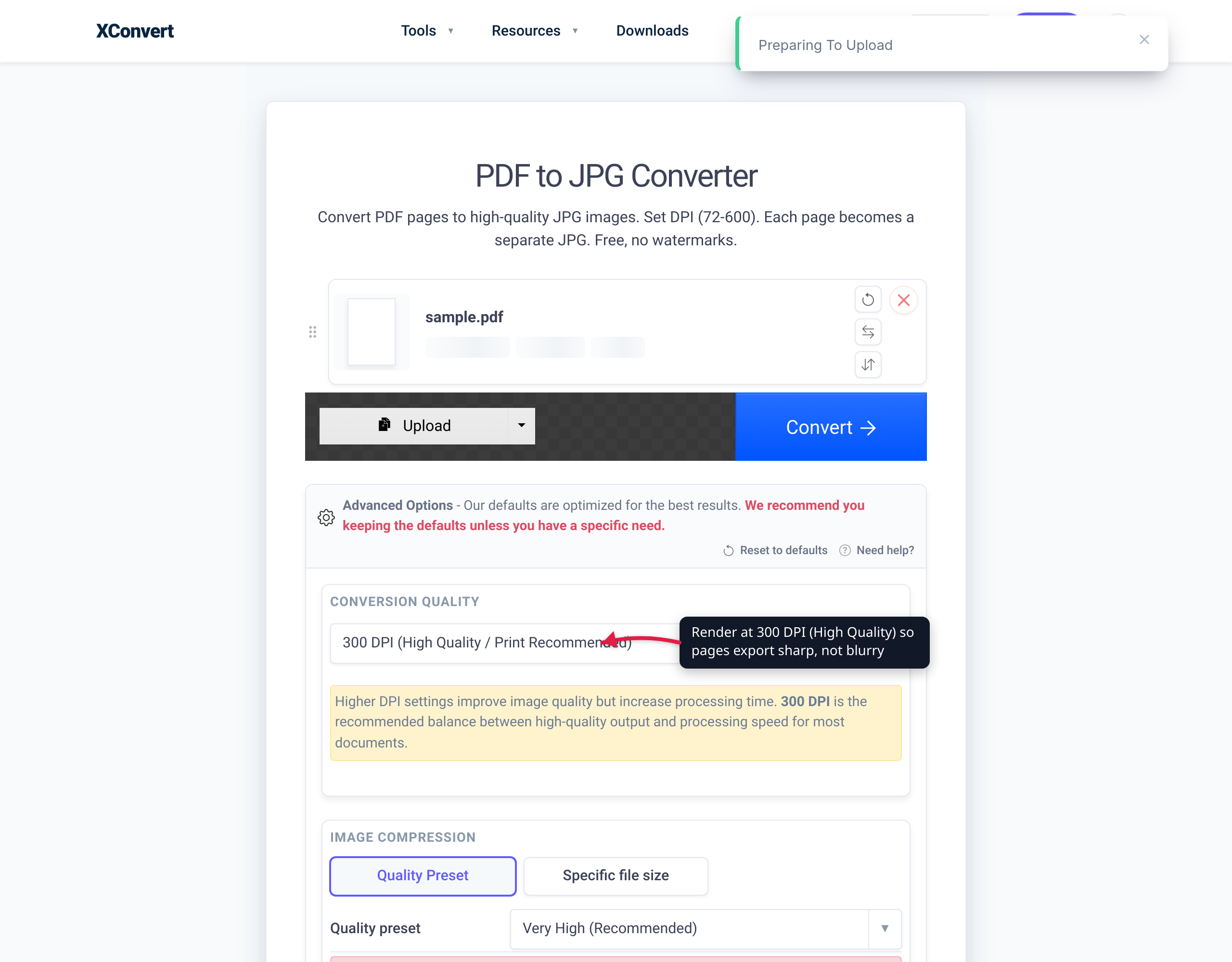
The xconvert PDF-to-JPG converter exposes the DPI control directly, which is what makes blur-free output a deliberate choice rather than luck. The relevant settings on the page:
- DPI dropdown — runs from 72 DPI up to 600 DPI, and defaults to 300 DPI (High Quality / Print Recommended). This is the single most important control for avoiding blur. Leave it at 300 for print, drop to 150 for on-screen use.
- Quality Preset — controls JPG compression; the default is Very High (Recommended), which minimizes the lossy “halo” artifacts around text edges.
- Resolution Percentage / preset resolutions / Width × Height — optional ways to constrain the final pixel dimensions if you need a specific size.
- File extension — choose JPG or JPEG for the output.
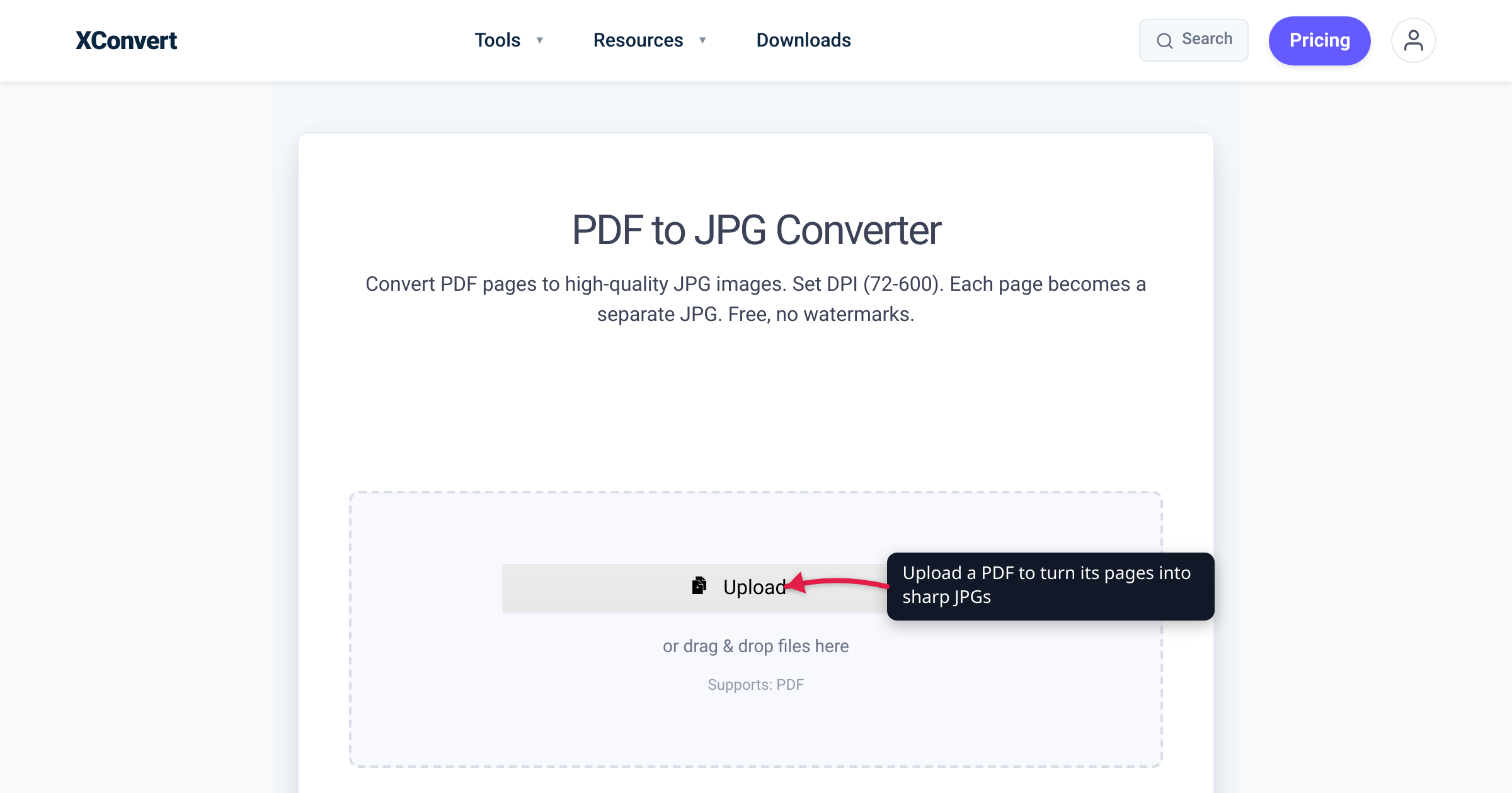
To convert: open the tool, click + Add Files (you can also pull from Google Drive or Dropbox), confirm the DPI is set for your use case (300 for print, 150 for screen), and run the conversion. Each PDF page becomes its own JPG.
Your file is uploaded over an encrypted connection, rasterized on our servers at the DPI you chose, and the uploaded file and its output are automatically deleted after a few hours — you don’t manage cleanup.
Two related tools worth knowing:
- Convert PDF to PNG — for text-heavy pages, PNG is often the better choice: it’s lossless, so there are no JPG compression halos around sharp text and line art. Same DPI logic applies (72–600 range).
- Compress PDF — if your goal was actually a smaller PDF rather than an image, compress the PDF directly instead of rasterizing it to JPGs, which keeps the text selectable and sharp.
FAQ
What DPI should I use to convert a PDF to JPG without blur?
Use 300 DPI for anything you’ll print, which renders a US Letter page to a sharp 2550 × 3300 px image — the print-industry standard. Use 150 DPI for on-screen viewing (1275 × 1650 px, crisp on any monitor with a much smaller file). Reserve 72–96 DPI for thumbnails only. On the xconvert tool, 300 DPI is the default, so the safe choice is already selected.
Why does my converted JPG look blurry even though the PDF looked sharp?
Because the PDF is vector (resolution-independent) but the JPG is a fixed pixel grid. If the converter rasterized at a low DPI — many default to screen resolution around 72–96 DPI — the page simply doesn’t have enough pixels to stay sharp when zoomed or printed. Raise the render DPI to 150 or 300 and the blur disappears. The exception is a PDF that’s actually a low-resolution scan, where there’s no hidden detail to recover (see below).
Will a higher DPI always make the image sharper?
Only up to the limit of the source. For a born-digital (vector) PDF, higher DPI keeps adding real sharpness because the page is drawn from math. But for a scanned PDF — where the page is already a fixed-resolution image — raising the render DPI past the scan’s native resolution just enlarges the same blur, like zooming into a small photo. Check by trying to select text in the PDF: selectable text means vector (scales sharply); a non-selectable image means it’s a scan with a fixed resolution ceiling.
Why is a 300 DPI file so much bigger than a 150 DPI file?
Because pixel count — and therefore file size — scales with the square of DPI. Doubling DPI from 150 to 300 quadruples the number of pixels (4×), so the file is roughly 4× larger. That’s the trade-off: 300 DPI buys print sharpness at the cost of size. For purely on-screen use, 150 DPI looks crisp at a quarter of the file size.
Should I use JPG or PNG for text-heavy pages?
For pages dominated by text or line art, PNG is usually better. PNG is lossless, so it avoids the compression “halos” JPG can leave around sharp text edges. JPG is the better pick for pages that are mostly photographs, where its compression is efficient and the artifacts are invisible. You can convert to PNG at the same DPI settings with the PDF-to-PNG tool.
Does each PDF page become a separate JPG?
Yes — rasterizing a multi-page PDF produces one JPG per page, since a JPG holds a single image. The pages are typically delivered as individual numbered files or bundled in a ZIP. If you instead want one combined file or a smaller version of the original document, converting to PNG or compressing the PDF may suit you better.
Is my PDF processed privately?
Your file is uploaded over an encrypted connection and converted on our servers, not in a way that requires an account. The uploaded PDF and the generated images are automatically deleted after a few hours, so you don’t have to remove anything manually.
Sources
Last verified 2026-06-18.
- ISO 32000-2 — Portable Document Format (PDF Association) — PDF specification; default user-space unit is the point (1/72 inch), establishing PDF as resolution-independent vector content.
- ISO 32000-1:2008 — Document management — PDF 1.7 — formal PDF standard reference.
- Foxit PDF SDK — Converting Pixels and Inches to PostScript Points — points-to-pixels formula (pixels = points ÷ 72 × DPI) and the 72 points-per-inch definition.
- xconvert — Convert PDF to JPG — DPI control range (72–600), 300 DPI default, Quality Preset, and the DPI cheat-sheet pixel dimensions (e.g. Letter at 300 DPI = 2550 × 3300 px).